Chapter 5 Results
5.1 Renewable Fuel Adoption
The below chart explores the average percent of renewable power generated in 2020 by each state. Renewable energy sources include wind, solar, geothermal, biomass, and hydroelectric power sources. We can see that Iowa is using mainly wind as its renewable energy source; whereas Hawaii is using mainly solar power.
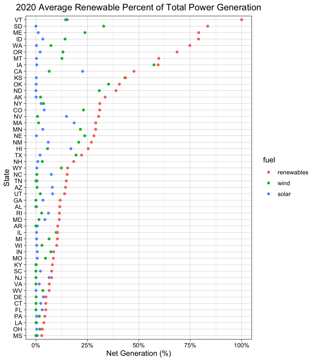
It is interesting to note that Vermont is already generating 100% of their power from renewable energy sources. Additionally, Delaware has the lower percentage of power generated from renewables with these sources comprising just over 2% of the average 2020 power.
Some states have set Renewable Portfolio Goals (RPS) that specify that utilities must sell a certain percentage of electricity that is generated from renewable sources. In their RPS, Delaware set a goal in 2005 to achieve achieve power generation that is 25% renewables by 2025; however, they have only achieved 2% renewables in the current year.
5.2 Macro Trends
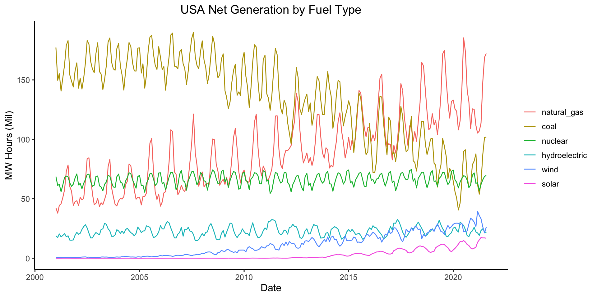
To explore macro trends in the energy sources utilized by the United States as a whole, the time series for each power source is plotted from 2001 - 2021. It is seen below that in 2001 coal was the predominant electricity source for America. Coal had a steady power generation until it began to decline around 2010. Natural gas took off at this time and by 2021 is the biggest producer of energy. Conventional hydroelectric was one of the first renewable energy resources to appear at significant levels in the electricity power generation for the US. Both solar and wind power have slowly increased in the amount of power they produce.
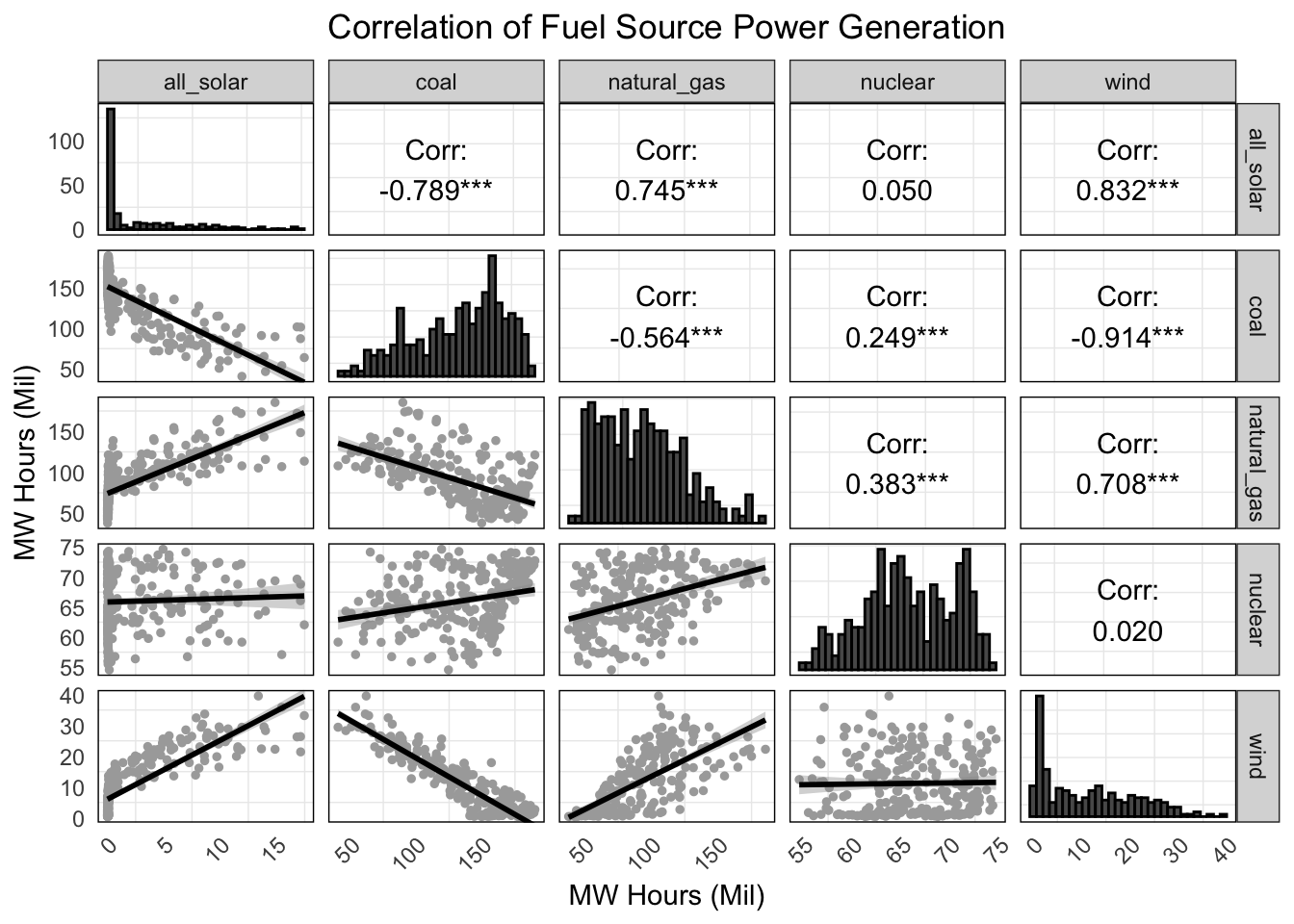
We can explore the relationship between specific fuel types to determine which are correlated. From the plot below, we can see that solar is negatively correlated with coal and positively correlated with natural gas and wind. This is not necessarily surprising because natural gas is typically used to complement variable renewable energy sources like solar and wind and act as a form of stability to produce power when the sun isn’t shining or the wind isn’t blowing. It makes sense that as the adoption of wind and solar energy increases, natural gas usage will also increase until a cleaner alternative is found. Natural gas is a cleaner fuel source than coal and produces 50% less CO2 emissions according to the Met Group. However, the cleanest alternative would be another renewable energy source that could help address the variability in production of wind and solar, like batteries.
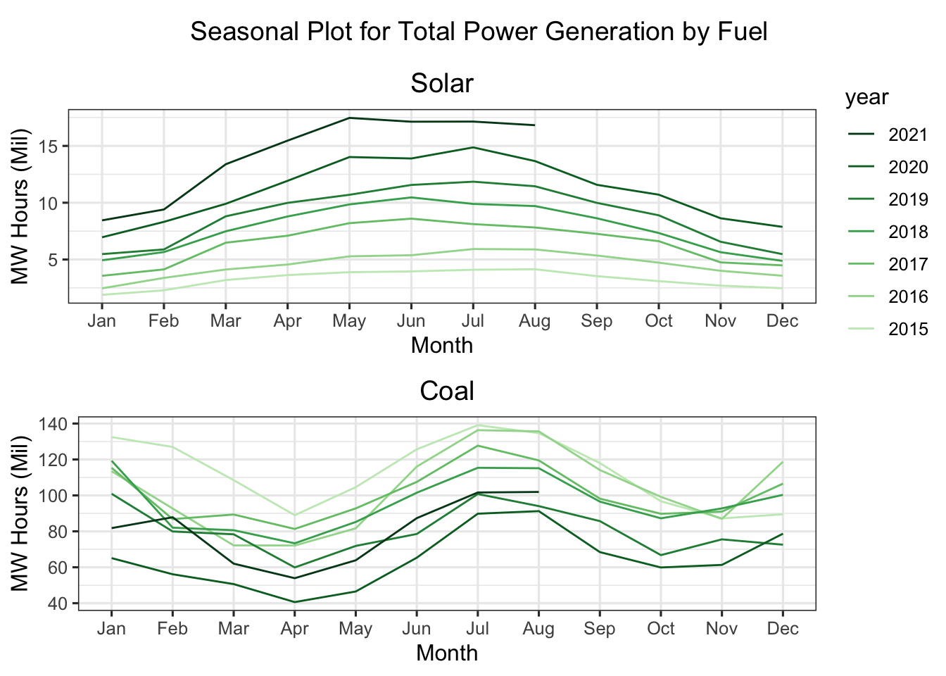
To explore the seasonal component of different fuels we looked at the seasonplot for 2015-2021, which was when solar was adopted more widely as a fuel type. The solar power net generation seasonal trend peaks in the summer months (May - August) and dips in the winter months. This is most likely due to the fact that there is more sunshine in the summer months, so more solar power is able to be generated. The coal plot shows the power generation trends overall. There is a peak in June - September and December - February. These peaks make sense because these are the times of year that energy demand is at the highest due to heating demand during the cold months and cooling demand during the hot months. In the seasonal plot, we can see that solar is increasing in production from 2015-2021, while coal is decreasing in production levels.
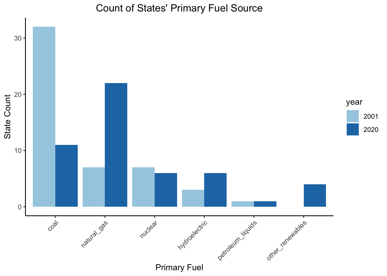
Next, we explore the primary fuel source for the USA states in 2001 and 2020. The most noticeable change in primary fuels can be seen from coal and natural gas. In 2001, 32 states used coal as the primary fuel, while by 2020 this number changed to 11. Natural gas experienced the opposite trend where it grew from being the primary fuel for 7 states to 22. Nuclear, hydroelectric, and petroleum liquids were also primary fuels for states in 2001 and 2020. These fuels did not see much change in number of states using them as their primary fuel. Renewables (other than hydroelectric) did become the primary fuel for 4 states (Iowa, Kansas, Maine, and Minnesota) in 2020, while in 2001 no states were using other renewables as the primary fuel.
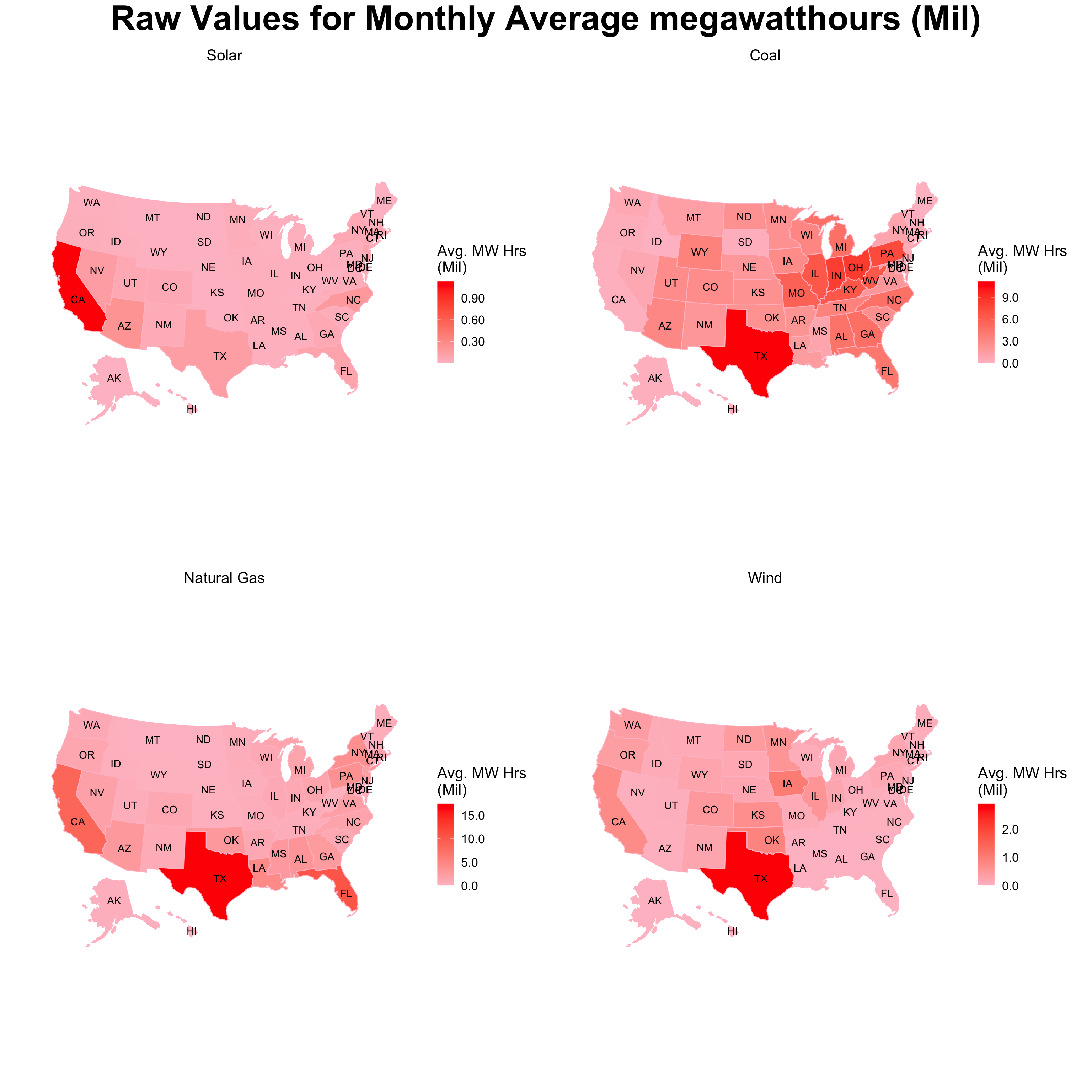
The heatmaps below provide insights into how the energy production is distributed over the United States. It can be noticed that California is the major producer of solar energy whereas Texas is the major producer of coal, natural nas, and wind energy.
However, we know that the size of every state is the United States varies a lot. Therefore, to account for the size and provide a better comparison of the energy produced in a state, we normalized the amount of energy produced by the area of the state and plotted it on a heatmap as done above. It can be noticed from this heatmap that Texas is no longer one of the dominating producer of coal and natural gas. In fact, Texas has one of the highest values for wind energy per square mile, following closely behind Iowa and Oklahoma. New Jersey, Massachusetts, and California have the most solar energy produced per square mile. West Virginia, Indiana, and Ohio are producing the most coal energy per square mile.
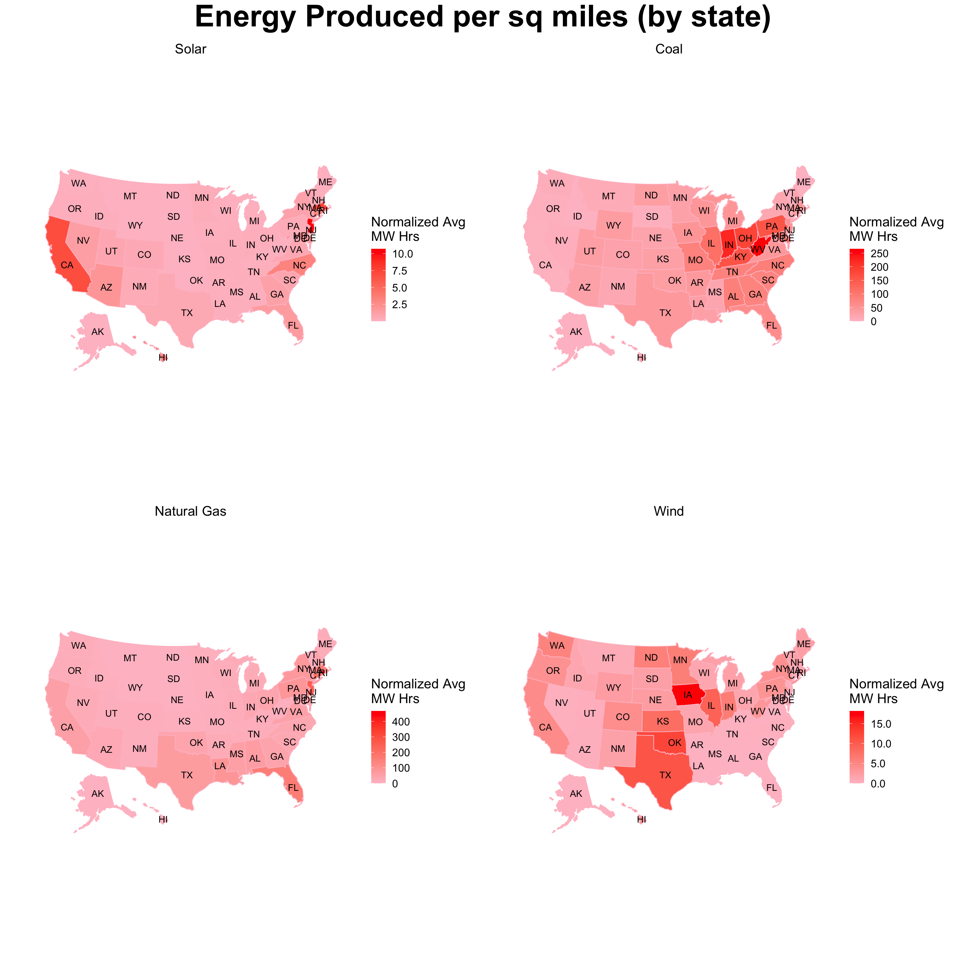
However, it should be kept in mind that the actual energy production is represented by the first plot where California and Texas are dominating producers of energy and the second plot only slows the energy produced per sq miles for every state.
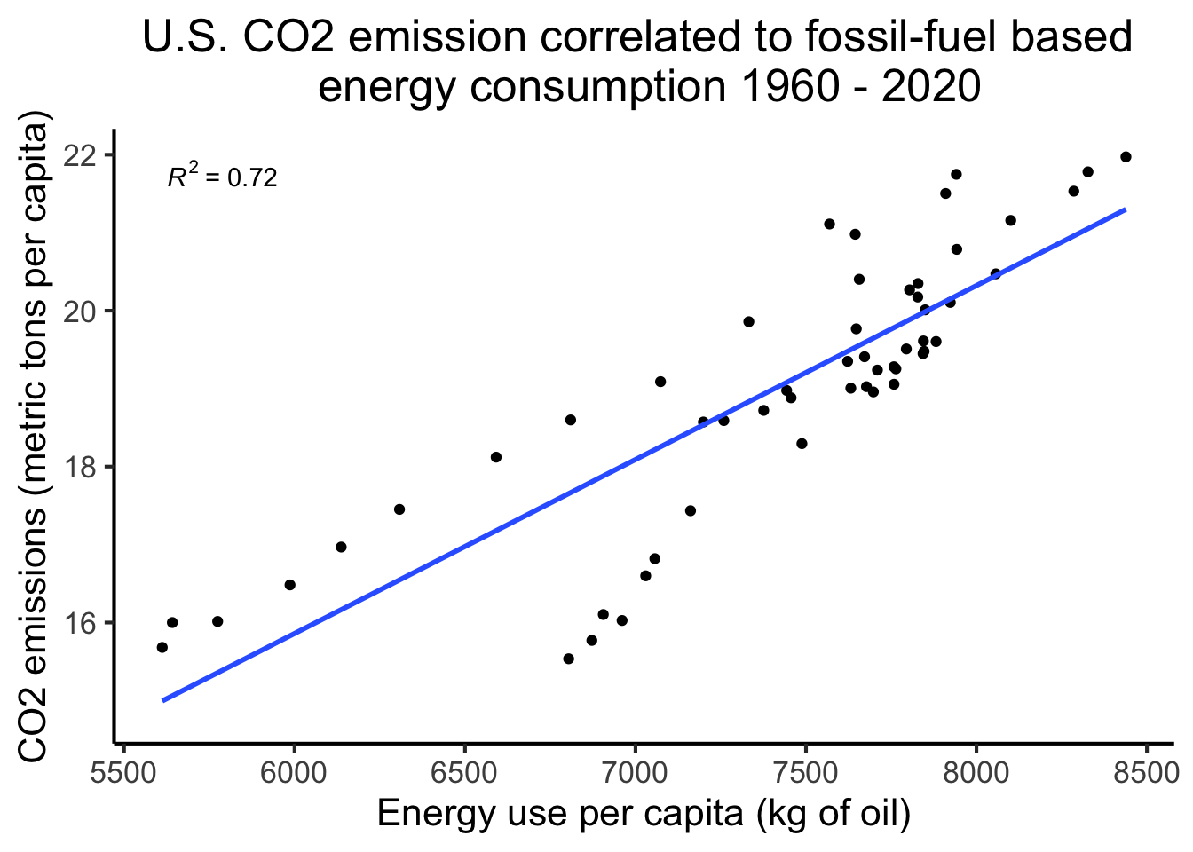
5.3 Correlation of Energy Consumption, CO2 Emission and Economic Indicators
The WB data validates that the CO2 emission is correlated with the fossil fuel based energy consumption in the United States. As more of our growing energy demands are met from fossil fuel based energy sources such as oil and coal – it leads to the rise of CO2 emission per capita. For example, we observed a more than 30% increase in per capita C02 emission between 1960 -1980 with about 50% increase in fossil-fuel based energy consumption.
The parallel coordinate plot below shows the correlation of per capita CO2 emission with the per capita fossil fuel based power consumption, overall electricity consumption and gross national income (GNI) along with gross domestic product (GDP %) change. The crossing lines between CO2 emission and electricity consumption represent the negative correlation of these factors as more electricity production shifted to clean and renewable energy sources. The electricity consumption maintained a positive correlation with GNI.
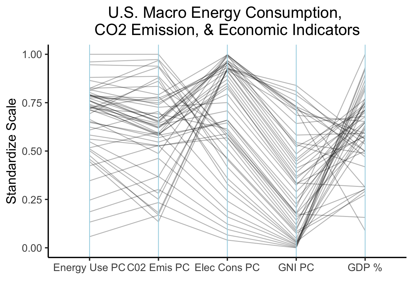
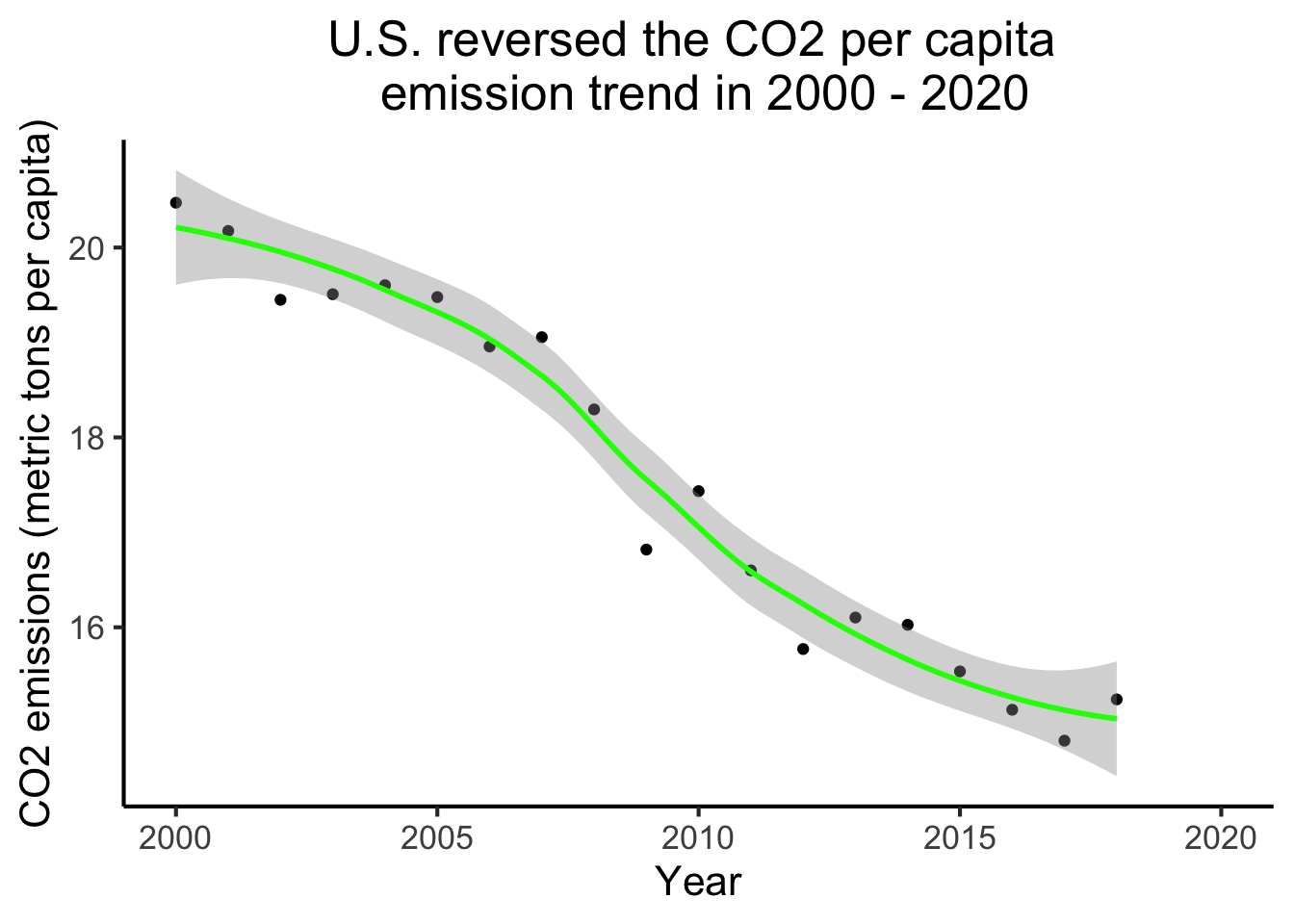
We observed the clear reduction in per capita CO2 emission of about 25% between 2000 - 2020 as more and more energy demands were met from clean and renewable energy sources, such as wind and solar, as well as natural gas, a significantly cleaner fossil-fuel compared to coal.